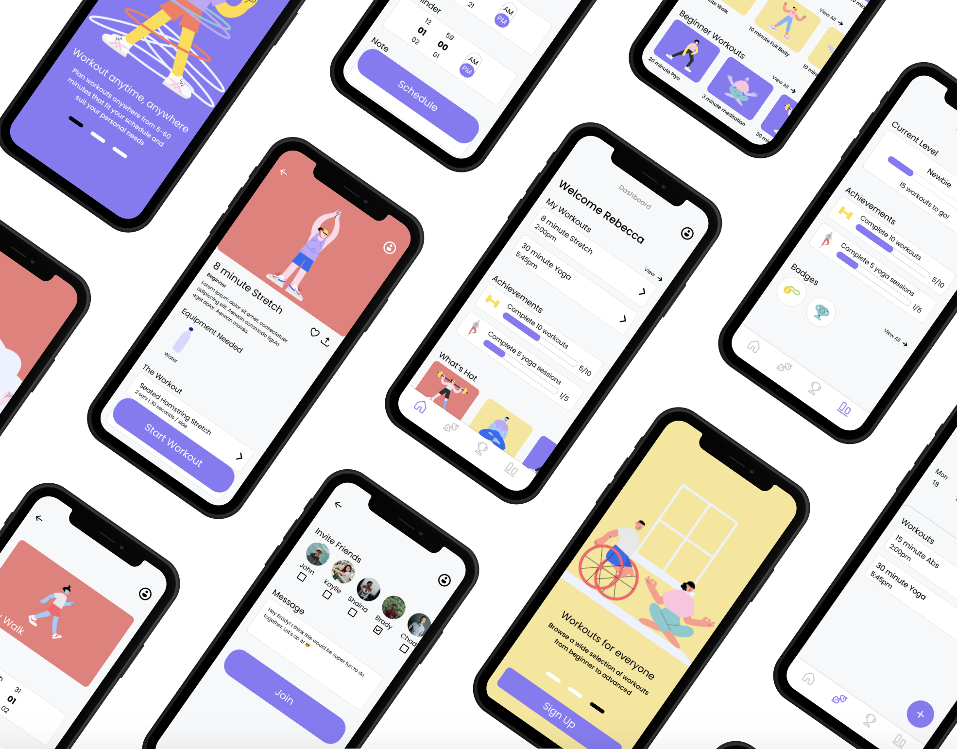
role: Sole UX/UI Designer Timeline: 1 month
Project Overview
The Problem
Exercise apps are an increasingly popular way to better your overall health. However, finding exercise routines for your specific level and ability can be difficult, especially if you want to try something new. It can be even harder to find a routine that fits into your busy schedule.
The solution
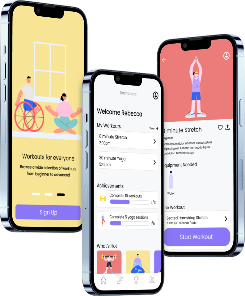
An app that helps people create an exercise routine of their choice by providing guides, examples, and info as well as workouts made for all types of people and schedules.
Scope
For this project, I was provided with most of the beginning research as well as the initial user persona and some user stories to begin my own research and ideation
Tools Used
Research
Competitive Analysis
Before I started my ideation process, I wanted to gain a better understanding of the market where Mvment would compete. This way, I can identify what these apps do well and what they don’t, and use that to help Mvment stand out. I was able to gain some valuable insights from these two apps below.
Strengths
Good UI
Good explanation of exercises
Variety of routines
Weaknesses
Not very inclusive
Has some body negativity terms (ex: “skinny vs regular vs extra”)
No form of encouragement
Define
Using this user persona, I’m able to refer to this to keep my designs user centered
User Persona
User Flows
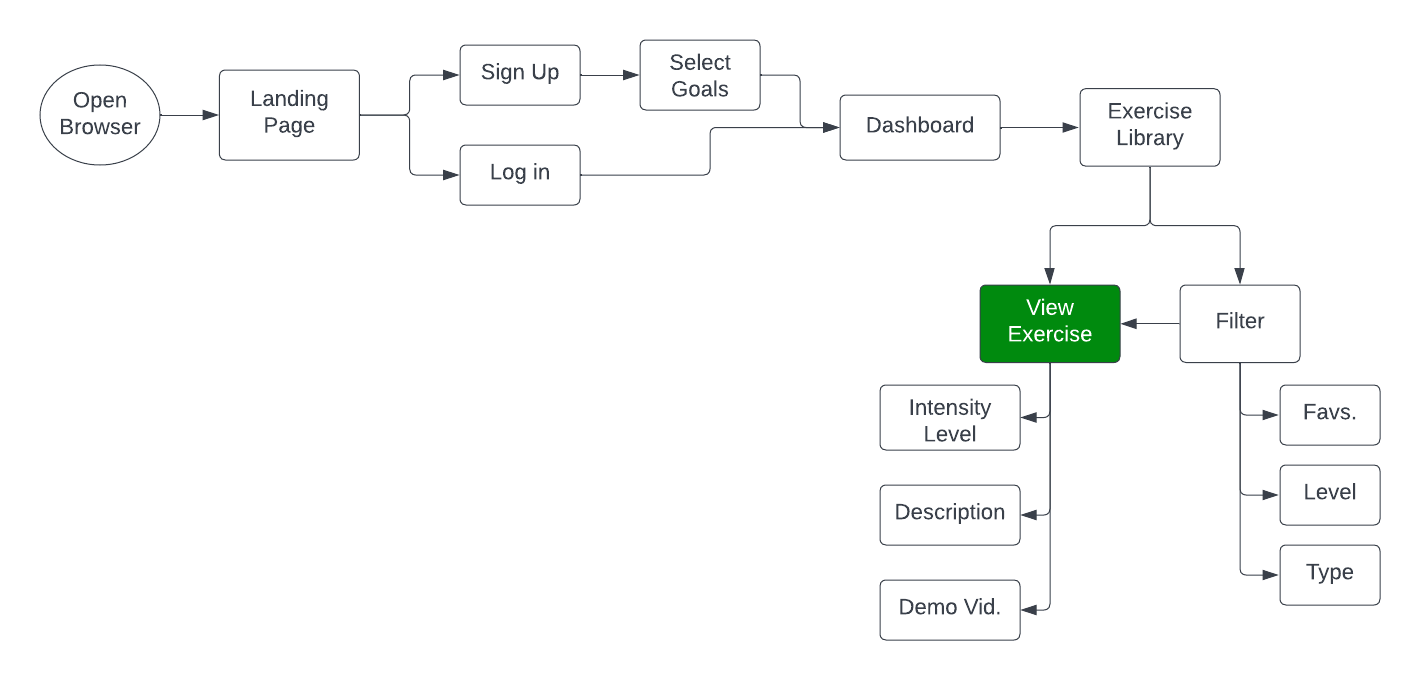
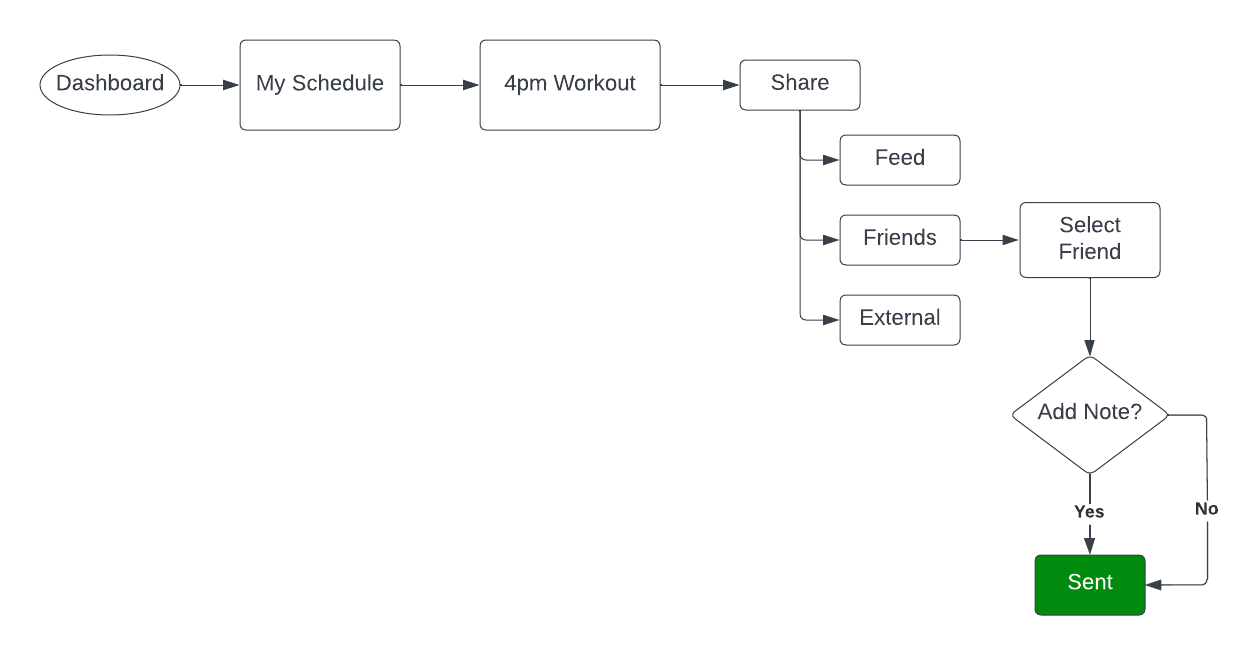
Using my user persona and user stories provided to me, I created some user flows to help visualize the information architecture of Mvment.
User Story 1 : As a new user, I want to be shown how the exercises are done, so I know I’m doing them correctly
User Story 2: As a frequent user, I want to be able to schedule exercises for working out, so that I build positive habits
User Story 3: As a frequent user, I want to complete daily challenges, so that I can have an additional way to stay motivated
User Story 4: As a frequent user, I want to be able to share routines with my friends that may be interested
Ideate + Iterate
Low-fidelity Wireframes
Before I got into the visuals of Mvment, I created some low-fi wireframes based on my user flows to lay the foundation for the app. I conducted a few preference tests in between iterations to ensure I had fresh eyes on my designs and that my designs were usable and functional (one shown for simplicity).
Task: View Exercise
Mood Board
Mvment’s brand is strength, energy, and flexibility. Users should feel these things when using the app. Mvment is beginner friendly, made to fit workouts into anyones schedule, anywhere. Mvment is accessible, inclusive, and fun. I created a mood board to help guide my decisions
The Issue: My original mood board was made up of a soft orange because orange evokes feelings of motivation and energy. However, when I was trying to ensure my designs were accessible, my contrast between colors did not pass the WCAG. Ultimately, I decided to change my color direction due to not being able to find a proper balance of color using a soft orange.
The Solution: I changed my primary color to a soft purple. Purple evokes feelings of strength and energy from red and freedom/flexibility from blue. I found this as a better fit for Mvment.
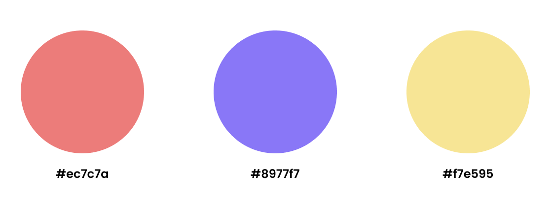
Color Palette
Because I wanted my app to be beginner friendly and fun, I wanted my color palette to be playful and exciting for the user. I chose a square color palette using my primary purple as the main color.
Style Guide
Final Thoughts
As this project focused more on the UI, it was a fun challenge playing around with different UI elements. I really enjoyed learning more about UI throughout the duration of this project.
If I had more time I would
Add a chat feature where users can interact closer with each other
Add a community threads section so users can answer each others questions and learn more


